The Review widget puts the reviews you have saved on the product pages they belong to: a rating summary plus the review cards, in the layout you choose. Its design lives in your theme editor, not in the app — this page covers both halves.
What it does#
Reviews you save are tied to a product, so the widget shows each product page its own reviews — nothing to pick per page. The widget has two parts, and each has its own setting: the rating summary (the average, the star row and the count per star) and the review cards themselves. You choose where the summary sits, how the cards look, which details each card shows, and how many columns.
Why use it#
Reviews are the most direct form of proof that your products work. Showing them in a clean, readable widget gives shoppers the confidence to buy.
How to enable it#
- Add your reviews first — see Managing reviews below.
- Open Growth → CRO and find Review widget in the Social proof group.
- Switch the toggle on.
- Choose Configure and click Save settings. The app side only switches the module on — a saved setup is what lets the widget render.
- Design it in your theme editor: Online Store → Themes → Customize, open a product template, then Add block → Apps → Uddom Review Widget (once added it stays there).
- Set Card layout, Display layout and the rest, then Save the theme.
Configuration#
In the app, Growth → CRO → Review widget → Configure holds one setting: Enable review widget. Every setting that decides how the widget looks lives on the Uddom Review Widget block in your theme editor, and those are the settings below.
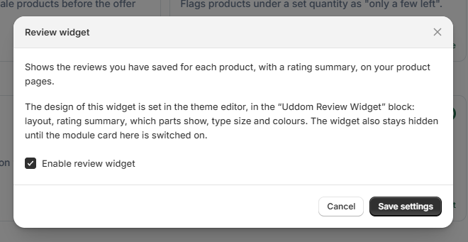 Growth → CRO → Review widget
Card layout#
How each review card is designed. Thirteen options; the first four also carry their own rating-summary arrangement, which you can override with Display layout and Summary layout.
| Card layout | What it looks like |
|---|---|
| 1. Summary + reviews side by side | Summary in a left column, reviews stacked beside it. |
| 2. Rating counts + grid | Rating counts across the top, then a grid of cards with the author on the left and the stars on the right. |
| 3. Rating metrics + grid | Centred cards: avatar, name, stars, title, review. |
| 4. Rating summary + filterable list | A one-column list with a star filter and a sort control shoppers can use. |
| Classic | Plain bordered card, rating on top, author below. |
| Grid | Equal blocks, with the stars divided from the text. |
| Masonry | Columns of natural height, so uneven review lengths stack tightly. |
| Card | Elevated card with a shadow, author moved to the top. |
| Compact | Dense list with a small avatar inline — good for many reviews. |
| Minimal | No card borders, just a hairline between reviews. |
| Slider | A horizontal row of cards. See Slider. |
| Testimonial | One wide, centred quote — best for a single review. |
| Photo Reviews | Full-bleed photo on top of the card, review underneath. |
Display layout#
Where the rating summary sits. This works with every card layout, so you can keep the card design you like and still move the summary.
| Option | What it does |
|---|---|
| Match the layout | Keeps the position the chosen card layout ships with. Default. |
| Summary on top | Summary above the reviews, whatever the card layout. |
| Summary on the left | Summary in a column on the left; the reviews (and the filter bar) sit beside it. |
| Summary on the right | Same, with the summary on the right. |
On phones the widget is always one column, so a left or right summary moves above the reviews automatically.
Summary layout#
How the rating summary itself is arranged — the average, the star row, the count per star and your summary text. Also independent of the card layout.
| Option | What it does |
|---|---|
| Match the layout | Keeps the arrangement the chosen card layout ships with. Default. |
| Stacked | One column: the average and stars, then the count per star, then your summary text. |
| Two columns | Average and stars beside the count-per-star bars; the summary text sits underneath. |
| Three columns | Average and stars, the bars, and the summary text side by side. |
The summary always counts the same published reviews the list below shows, so the two can never disagree.
Summary copy#
| Setting | What it does |
|---|---|
| Show the rating summary | Shows or hides the whole summary block. Default: on. |
| Show the reviews | Shows or hides the review cards. Default: on. |
| Base font size | 10–24 px, driving the whole widget's text sizes. Default: 14 px. |
| Heading | Optional wording shown with the summary, and above the list in the filterable card layout. |
| Summary text | Optional sentence or two under the summary. |
Review content#
Which details each card shows: Show rating, Show review title, Show review description, Show review images, Show reviewer name, Show reviewer photo, Show verified badge, Show review date and Show imported review source — the label that marks a review you imported (for example “Imported from Amazon”). All are on by default.
A card with one review image shows it full width. A card with two or more shows them as a row of thumbnails.
Columns and images#
| Setting | What it does |
|---|---|
| Desktop columns | 1, 2, 3 or 4 cards per row. Tablet shows one fewer, and mobile always shows one. Default: 3. |
| Review image ratio | Square, Landscape 4:3, Wide 16:9 or Portrait 3:4. Default: Landscape 4:3. |
Slider#
Turning the slider on shows the reviews as a horizontal row instead of a grid. Shoppers can swipe on mobile and use the arrows or dots.
| Setting | What it does |
|---|---|
| Enable slider | Turns the reviews into a slider. Default: off. |
| Items on desktop | 1, 2, 3 or 4 cards per view. Tablet shows one fewer. Default: 3. |
| Items on mobile | 1 or 2 cards per view. Default: 1. |
| Autoplay | Advances the slider on its own. Default: on. |
| Autoplay speed | 2000–9500 ms between slides. Default: 4000 ms. |
| Slider controls | Arrows and dots, Arrows only, Dots only or None. Default: both. |
Appearance and colours#
| Setting | What it does |
|---|---|
| Card radius | 0–40 px corner rounding. Default: 12 px. |
| Card gap | 0–50 px between cards. Default: 20 px. |
| Section spacing | 0–120 px above and below the widget. Default: 48 px. |
| Star colour | Default: #F5B301. |
| Text colour | Default: #222222. |
| Card background | Default: #FFFFFF. |
Managing reviews#
Reviews live in Growth → Reviews. From there you can Add review manually, or Import reviews from AliExpress, Amazon or a CSV file. When you write a review by hand you can attach a reviewer photo and review images — those are the pictures the widget shows.
Only reviews with the status Published appear on your storefront. Hidden reviews stay in Uddom but are not shown.
An import carries the review text only. Photos and reviewer avatars from the source site are never copied, and an import never marks a review as a verified purchase. During an import you confirm that you own the reviews or have permission to use them, and imported reviews are labelled on the storefront (“Imported from Amazon”, “Imported from AliExpress” or “Imported review”). You can hide that label with Show imported review source.
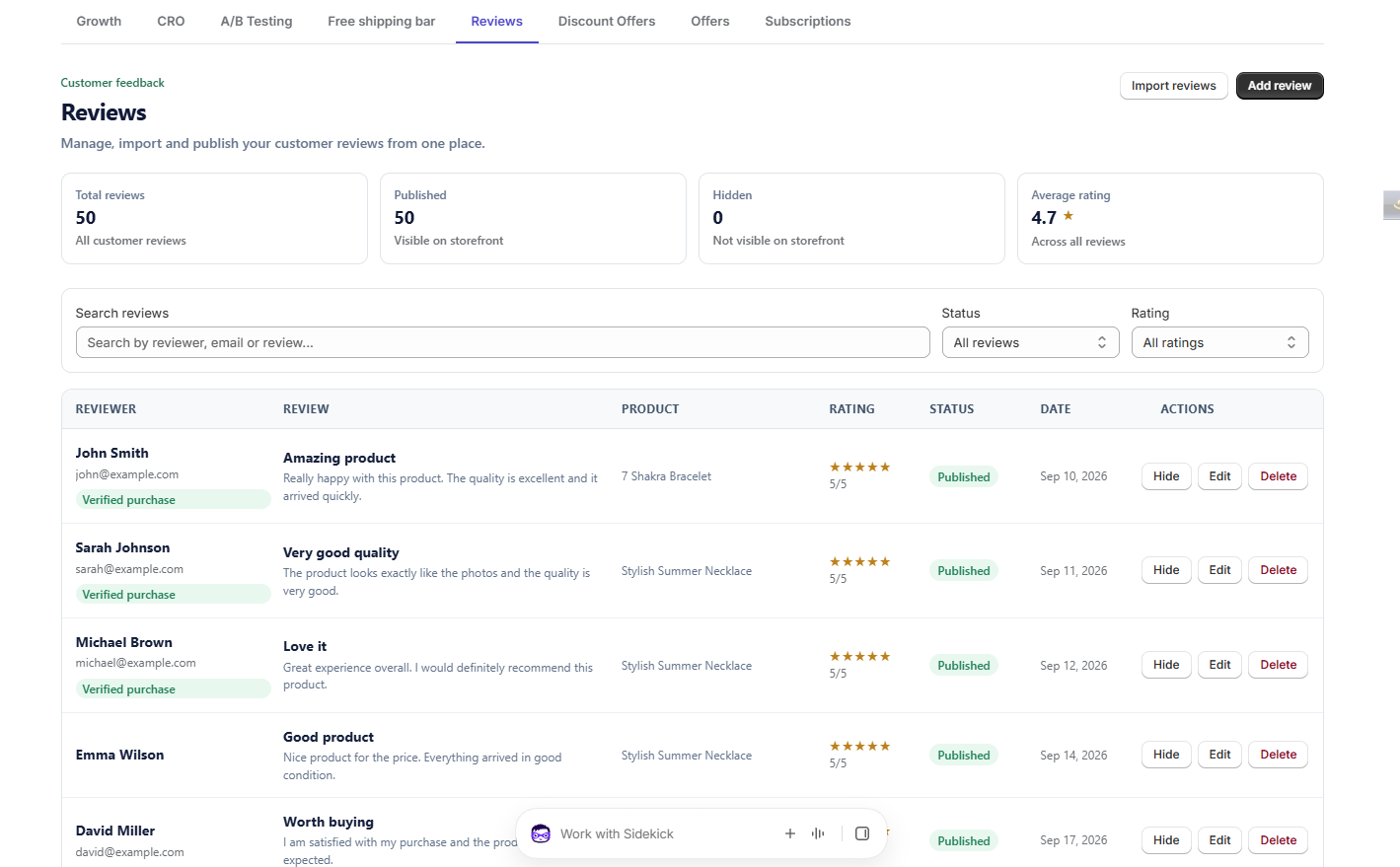 Growth → Reviews list
What customers see#
Shoppers see the rating summary where you placed it — the average, the star row and the count per star — then the reviews in your card layout, showing the details you enabled. Imported reviews keep their source label. In the filterable card layout shoppers can also filter by star rating and sort the list.
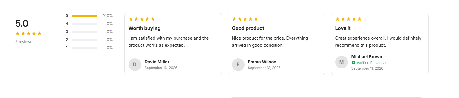 Storefront result: review widget on a product page
Best practices#
- Turn on Show verified badge only for reviews that genuinely came from real purchases — an import never sets it for you.
- Add photos to the reviews you write by hand: imports cannot bring them, and photo reviews tend to be the most persuasive.
- Use the filterable card layout when a product has enough reviews that shoppers will want to narrow them down.
- Check the widget on a phone — every display and summary layout falls back to a single column there.
Troubleshooting#
- The widget is empty. Confirm the product has published reviews, that the Review widget toggle is on in Growth → CRO, and that you clicked Save settings there once.
- Reviews do not update. New reviews must be published before they appear.
- My theme editor does not show the newest settings. Close the theme customizer completely and open it again — the editor keeps the settings it loaded when the session started. If it still lags, remove the Uddom Review Widget block and add it again.
- The summary stays on top even though I picked a side. On screens under 750 px the widget is always one column.
- Photos are missing. Imported reviews have no photos. Add them when you write a review by hand, and confirm Show review images is on.